Warm, opening, soothing music and a real unique set up for Lucia Hwang’s art exhibit, I strongly recommend everyone to see this. Her art game me a unique meaning. Before I explain what I depicted out of her art I am going to introduce some Lucia.
Lucia was born in Korea and has a BA in fine arts. “What’s Up?” is describe as “The moment we open our eyes in the morning, we begin the process of acceptance and rejection of the world that surrounds us. We accept the things familiar, soothing, comforting and valuable in our lives. We also reject both in physical and in psychologies, those that do not comfort our souls. The dichotomy of love and hate, pride and humility in everyday life is the basis of this work. The conflict occurs when we are unable to either accept or reject the reality that surrounds us. This work represents the inner conflict that material world challenge to our innermost emotional well-being. We are all vulnerable and fragile individual easily manipulated and solicited. Yet deep in our heart, we know the outer shell does not even begin to represent the pulsating and ever-growing inner individuality.”
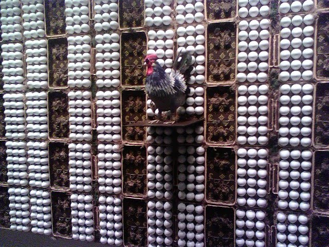
As I looked at the mix media art I noticed three main pieces Project I, Louise Chicken 9’ x 5’ x 1’, Project II, Trash Can 7’ x 5’ x 2’ and Project III, Thinking about you, 8’ x 8’ x 2’.
 Thinking about you, 8’ x 8’ x 2’.
 Project I, Louise Chicken, was of a chicken that was hip hopped out. Holding a bag with the initials “CL” stamped on it. In comparison the egg cartoons also had the same stamp referencing each other. The initials hold the same design as Louie Phonton.
Judging by the name of the piece I understood the mix media representing change and challenges. As we wake up and look around we notice things but we may fail to act on them. Rejecting ourselves from taking on the challenge of change because of the outcome we may discover.
What I really enjoyed about the works of art is a person can and could come up with their own personal meaning to the piece of art.
Project II, Trash Can, was very unique. The piece of art was of a trash can lying sideways and open on the ground, attached to the can is a chain that is locked and keyed to a post. Lying next to the can is a sign that reads “Private Property Keep Out.” Once again the initials “CL” are stamped on the can.
As I continued to look at this work of art I gathered this piece  could
could  represent wealth and fame. The trash can is open for the public to view what is in side and no matter how much you make a point to say my life is my life it is still open for the world to view. By chaining the can your showing owner ship and requesting others to keep out, however that doesn’t always happen and I believe that is what the work of art is representing and presenting.
 could
could  represent wealth and fame. The trash can is open for the public to view what is in side and no matter how much you make a point to say my life is my life it is still open for the world to view. By chaining the can your showing owner ship and requesting others to keep out, however that doesn’t always happen and I believe that is what the work of art is representing and presenting.
Project III, Thinking about you, is of 365 rolls of toilet paper scattered around a toilet! Stamped onto the rolls of toilet paper are the same initials as the other pieces. All works of art correspond and represent one piece due to the stamping of the initials

As I viewed this work I decided it represented the fast paced world and how people do not have time to think of others or relax. Judging by the name of the work of art it gave me the thought the art shows the only time someone will have time to think or relax is while in the bathroom. I believe this happens to many individuals with the economy.
I really enjoyed this exhibit and would definitely say it was one of my favorites. I strongly feel there is a lot of philosophy and politics represented in these pieces. I encourage all to view and come up with your own ideas for what the artist is trying to show!
Next exhibit brought me to “Pixel and Pen,” digital artist with hand rendering and computer drawing. This exhibit held 12 different digital art artists.
I am not much for digital art and I don’t have much of an opinion on it, however, I did find two pictures I found very interesting!

Q. Cssetti, portrait of Kitty, 2008, digital art. I really liked this piece because it didn’t look like digital art but rather of a painting. This piece was very defined and simple. The artist used very simple colors with limited shades. She did a really good job with the form of the picture and clarity. I found myself seeing this picture out of all the others. It popped and was easy to focus on.
The next picture was Roman Versotko, Madame Curie, 2006, ink on paper. This work of art was very soft and un-noticeable. It was very difficult to make out the picture and reminded me on Japanese art with ink on paper. The color looks like color pencil detail and holds Japanese letters/ words on the bottom. I believe this picture allows the viewer to day dream and use their imagination. If it is anything like Japanese art I would assume the picture and wording is of a poem or letter. 

I wasn’t as impressed with the digital art as I was with the mix media. The room and atmosphere of each room was different as well. I believe it could have been due to the location and lighting. Pixel was located in the main entrance of the school and was surrounded by windows with many students walking around. The other exhibit is in walking distance of an entrance but wasn’t as occupied.

No comments:
Post a Comment